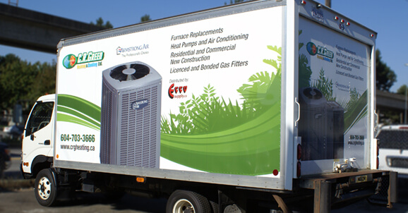
While car branding in the form of a car wrap is an excellent way to draw business to your local operation, it can also fizzle out if you do not use a reputable wrap company for the installation. Reasons a wrap fails to deliver its message is often due to its design, message, or placement. In most cases, the wrap is not installed correctly or the material is of an inferior quality.
#1 – Selecting the Wrong Film
Not all vinyl is created equally. Therefore, selecting the wrong film and over-stretching the material can distort the color and graphics. You need to make sure a high-quality film is installed.
#2 – Failure to Fully Prep the Car’s Surface
Also, make sure that the vehicle is prepped for a vinyl wrap. That means taking it through the car wash and making sure that all the oil and dirt are removed on the vehicle’s surface. Otherwise, the wrap will not hold as well, or may even lose its grip. Dirt or dust can show through a graphic and silicon or oil residue can lead to bubbling of the wrap.
#3 – Overstretching the Material
While having too much material to wrap your vehicle can be pricey, not having enough can turn out to be costly to the image of your business. If you don’t have enough material, the wrap can be overstretched. Over-stretching often can be seen in such areas as compound curves, the bumper, or the deep inset panels of some vehicles.
#4 – Not Post-heating the Wrap
A vehicle wrap is a form of polyvinyl chloride or PVC. One property of PVC is its ability to conform to its original shape. Therefore, to make sure that the vinyl stays in place, post-heating is required.
That is why it is important to choose a vehicle wrap company, such as Canawrap – or one that knows all the ins and outs of wrapping a vehicle. Make sure your message and design are as well-received as the wrap installation itself.
#5 – Creating a Poorly Integrated Design
Every angle, curve, and space on a car must be considered when designing a wrap. Ignoring these basic elements will result in a design that is difficult to read or comprehend. This type of outcome negatively impacts your company’s image.
#6 – Making the Message Too Long
Also, the message on your wrapshould be short and succinct. Keep the message down to four words or less. The text, which, in some cases, is incorporated with the logo, should be legible, large and instantly recognizable.
References:
http://www.visaliaidea.com/graphics-wraps/wraps-fail.html
http://www.fespa.com/news/features/seven-secrets-to-a-perfect-car-wrap.html
Picture Credit:
Canawrap Gallery

