In order to gain notice for your business, you need to use the right graphics, colors, and lettering. Canawrap does it better because we have the know-how and experience to understand what works and what does not work. Graphics need to be configured to the car so nothing is misplaced.
In addition, both the fonts and images should be coordinated so the message is instantly understood. Drivers only view wraps for a few seconds. Therefore, the message must be dominant and easy to digest.
An Example of What We Do
To give you an idea of how a well-designed message can be included on a wrapped vehicle, the following picture notates this point.
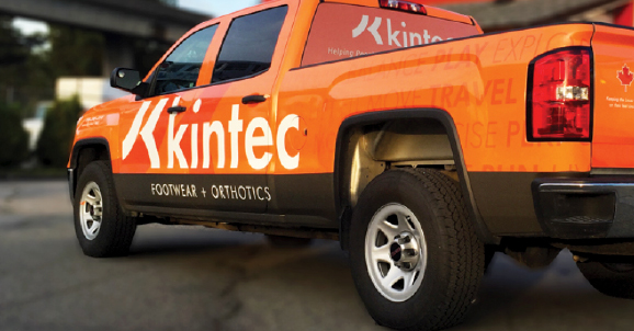
The vibrant orange color draws you to the name of the company and to what it sells. Whether this message is displayed on a car or truck, it is immediately recognized. The over all Brand image that Kintec has built and maintained is brought in to the truck wrap graphics.
We Know Which Cleaning Products to Recommend
Canawrap also has trained designers who know how to correctly place a wrap on a vehicle. Cleaning products are also recommended and available to keep the messaging looking first-rate.
Another Standout Example
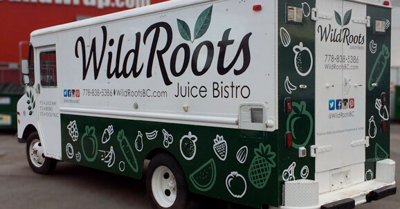
The following picture is also another example of how Canawrap designs immediately capture the consumer’s attention.
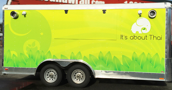
The distinctive yellow color instantly draws your attention to the name of the business. The clean layout of icons also nicely contrasts with the primary color. In addition, the visuals and lettering are placed so they can be easily read.
What you choose in a wrap design firm is vital to your company’s local ad exposure and success. At Canawrap, we can meet those concerns by offering premium wraps that are easy to recognizeand remember.
References:
Images:
