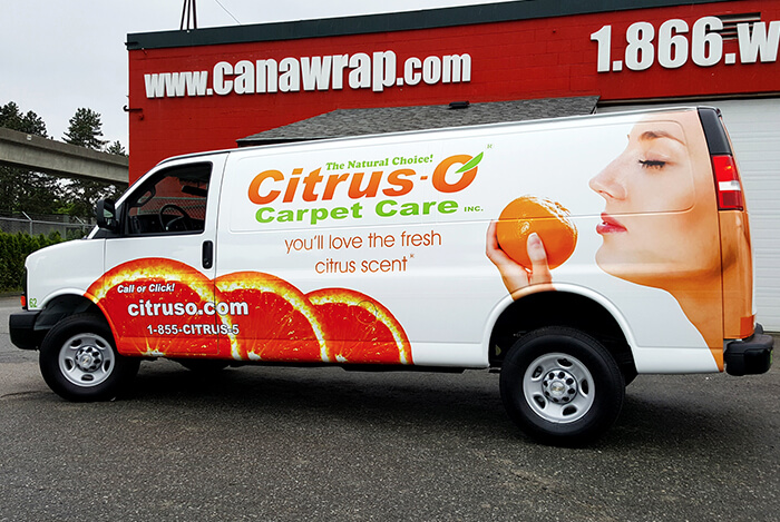
Truck wrap design can be the reason your advertisement converts or not. It’s easy to get carried away during the design process but it’s important to keep in mind that the aim is to get as much business from this as possible.
The words on your truck wrap have a major effect on its success. Here are some words to avoid when planning your design:
Long And Complicated Words
Truck wraps are generally used as mobile ads and need to be quickly absorbed by the target customer.
These customers would only have a few seconds to view, acknowledge and decide whether the ad is worth their time or not.
Shorter and simpler words are better to use as they’re easily read and understood by passing motorists and customers.
Words In Thin Fonts
During the process of designing a truck wrap, sometimes the design can be more artistic than practical. Thin and elegant fonts are generally loved by artistic people, unfortunately, these don’t convert as good as clearer fonts do.
You need to make your point very clear, very fast! Thin fonts are easily stripped away from a viewer’s vision.
Thicker fonts or bolded fonts are recommended. This can increase the visibility distance of your truck wrap and allows your message to stand out.
Rude/Vulgar Words
The design of your vehicle wrap and the message it conveys reflects directly on the owner and the company’s character and credibility. Aside from getting conversions, you want your design to reflect the type of business you can offer.
Using your vehicle as a mobile advertisement will result in a higher reach and more impressions.
You need to realize that adults will not be the only people who see and read the advertisement, but children will also see it.
Using rude, vulgar words or phrases on your truck wrap can deliver a bad message about your brand or business.

