

January 18, 2026
Back to Blog
Colour is often treated as a design preference when it comes to vehicle wraps. Contractors choose colours they like, colours they are used to, or colours they think look modern.
The problem is that colour choices directly affect whether a vehicle wrap is noticed, understood, and remembered.
This article explains how colour impacts visibility and recall on a vehicle wrap, why some colour combinations fail in the real world, and how contractors can make smarter colour decisions that actually improve results.
Short Answer
Colour has a major impact on how visible and memorable a vehicle wrap is.
High contrast colour combinations improve readability and recall, while low contrast or trendy colour choices often reduce visibility and cause wraps to blend into traffic.
Why Colour Matters More Than Most Contractors Think
Colour is one of the first things the human brain processes.
Before someone reads text or recognises a logo, they register colour. On a moving vehicle, colour often determines whether the wrap is noticed at all.
If the colours do not stand out from the environment, the wrap gets lost, regardless of how well it is designed.
Visibility Comes From Contrast, Not Preference
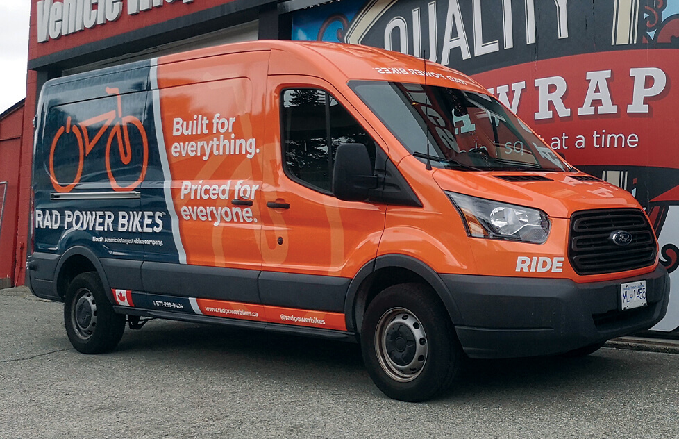
The most effective vehicle wraps use strong contrast between the background and the text.
Light text on a dark background or dark text on a light background is easier to read at a distance and at speed. Low contrast combinations may look stylish, but they often disappear in real world conditions.
What looks good on a screen does not always perform well on the road.
Why Some Popular Colours Underperform
Certain colours are commonly used because they feel safe or modern.
Greys, muted tones, and subtle colour palettes often look clean up close, but they can blend into roads, buildings, and weather conditions. In overcast or low light environments, these colours lose impact quickly.
This does not mean these colours can never work, but they require careful contrast and layout to remain effective.
How Colour Affects Brand Recall
Consistent colour use improves recognition.
When people repeatedly see the same colours associated with the same business, those colours become part of the brand’s identity. Over time, the colours alone can trigger recognition before the name is even read.
Changing colours frequently or using inconsistent palettes across vehicles weakens this effect.
Environment and Weather Matter
Colour performance is affected by real world conditions.
Rain, snow, shade, and overcast skies all change how colours appear. In Canada especially, wraps need to remain visible in a wide range of lighting and weather conditions.
Strong contrast helps maintain readability no matter the season.
What This Means for Contractors
When choosing colours for a vehicle wrap, visibility should come before personal preference.
Contractors who prioritise contrast, consistency, and real world visibility see better recognition and stronger long term results. Colour is not just a design choice. It is a performance decision.
Final Thoughts
The right colour choices make a vehicle wrap easier to see, easier to understand, and easier to remember.
When colour is chosen strategically instead of emotionally, a wrap works harder and delivers better value over time.